

section_industries
container-large
padding-global
prime_component
casy_track
text-size-medium
is-reverse
padding-small
border-radius-full
background-secondary
section_industries
container-large
padding-global
prime_component
casy_track
text-size-medium
is-reverse
padding-small
border-radius-full
background-secondary
section_industries
container-large
padding-global
prime_component
casy_track
text-size-medium
is-reverse
padding-small
border-radius-full
background-secondary
overflow-hiddeh
gap-small
use-cases_item
use-cases_row
badge-list_component
marquee-track
content-tags_component
focus-areas_component
spacer-large
margin-bottom
overflow-hiddeh
gap-small
use-cases_item
use-cases_row
badge-list_component
marquee-track
content-tags_component
focus-areas_component
spacer-large
margin-bottom
overflow-hiddeh
gap-small
use-cases_item
use-cases_row
badge-list_component
marquee-track
content-tags_component
focus-areas_component
spacer-large
margin-bottom
Framework Principles
This framework is built on a set of principles that make it easy to edit content, scale projects, and maintain consistency across the entire template. Each template follows a clear structure and logical system, allowing you to quickly understand how everything works and make changes without breaking the layout.
This is what sets these templates apart from many others.Instead of simply recreating designs from Figma, every section is built with its own structure and purpose, ensuring flexibility and long-term usability.
This is what sets these templates apart from many others.Instead of simply recreating designs from Figma, every section is built with its own structure and purpose, ensuring flexibility and long-term usability.
System First
System Thinking Over Visual Design
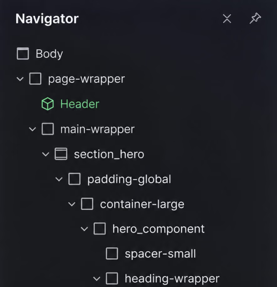
The development process is based on system thinking rather than creating isolated sections or elements. Each part of the layout is designed to work as part of a larger system.
Consistent structures are reused across different sections, making it easier to manage content and add new elements without starting from scratch. This approach simplifies the editing process and saves time.
Consistent structures are reused across different sections, making it easier to manage content and add new elements without starting from scratch. This approach simplifies the editing process and saves time.
Built to Scale
Focus on Scalability and Reusability
Every element in the template is built to be reusable across different pages and sections.
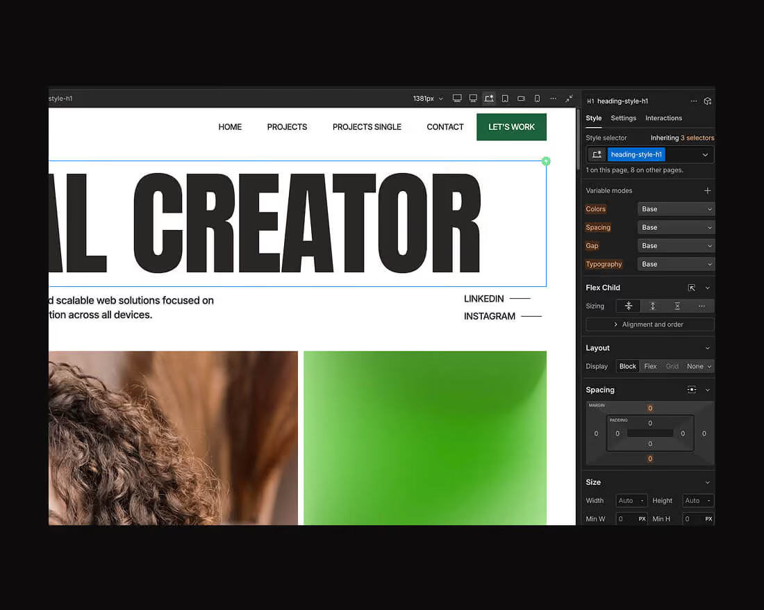
When you update a class, the changes are applied everywhere it is used. This makes scaling the project faster and keeps the design consistent without extra effort.
When you update a class, the changes are applied everywhere it is used. This makes scaling the project faster and keeps the design consistent without extra effort.
Client-First Class System
The framework is built using the Client-First methodology, providing a clear and consistent class system that is easy to edit, update, and scale. This structure helps you maintain the project without getting lost in class names or hierarchy.
Utility-First Structure
The class system is built around utility classes that control spacing, alignment, and layout. These classes are used consistently across the entire template and follow Webflow Marketplace best practices. This approach keeps the structure clean and reduces the need for creating unnecessary custom classes.
Consistent Spacing Strategy
All spacing follows a predefined scale that is applied across the entire project. You can easily adjust or extend this system using variables in the Webflow project settings. This allows you to update spacing once and have it applied consistently throughout the template.
Global Classes and Reuse
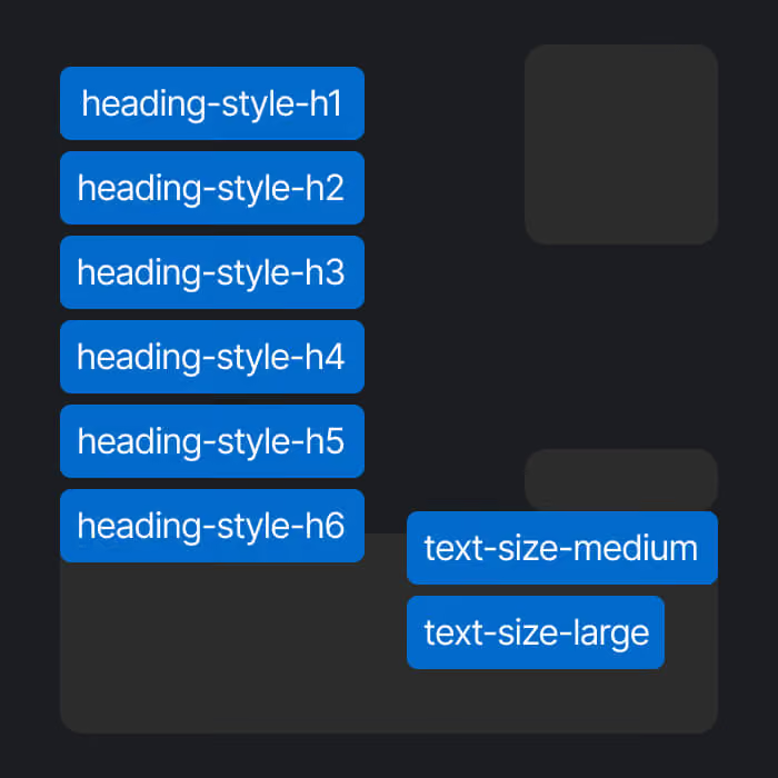
Global classes are defined across the template to ensure consistency and efficiency. This makes it faster to apply changes and helps avoid class duplication. Updating a global class will automatically apply changes wherever it is used.
Class Naming Conventions
The class system in each template is designed to be clear and easy to understand. It helps you quickly learn the structure and find the elements you need. Class names for text styles, spacing, and layout are reused across the project. When you update one class, the changes are applied throughout the entire template.
Readable and Predictable Naming
Class names follow a clear and consistent structure, making them easy to read and scale. This speeds up the editing process and makes updates faster and more efficient.
Avoiding Class Chaos
This methodology helps avoid class duplication and reduces confusion as the project grows. It keeps the structure clean when adding new pages or content.
Scalable Structure Across Pages
You can reuse section and component classes across different pages. The structure and logic remain consistent, so you don’t need to create unnecessary new classes.
This approach makes the project easier to manage for both designers and clients.
CMS Collections Architecture
The CMS structure is simple, clear, and easy to understand for any user. All fields follow Webflow Marketplace guidelines and are named in a clear and predictable way. Each collection has a logical purpose and includes only the necessary fields for easy content management. All content is dynamic, so you can update it in one place and see changes applied across the entire template.
Collection Structure and Separation
Each CMS collection has a well-defined structure with clear and organized fields. Content is separated into collections such as Services, Projects, and Blog Posts. For better usability, each collection also has a dedicated template page where all fields are properly structured and displayed. This makes editing and managing content much easier.
Reference and Multi-Reference Logic
Reference and multi-reference fields are used to connect collections and simplify content management. This allows you to link related content across the project. For example, you can connect blog posts to categories, services, or authors. This makes the content more structured, flexible, and easier to manage.
Dynamic Content Strategy
The CMS is designed to support dynamic content across multiple pages and sections. You create content once and reuse it throughout the template without duplication. This approach saves time, keeps content consistent, and makes the project easy to scale as it grows.
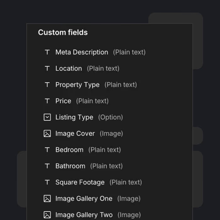
You only need to update content in one place, and it will be updated across the entire website.
Reusable Components System
Each template includes reusable components that can be used across multiple pages. This approach reduces repetitive elements and allows you to update content quickly and efficiently.Key content inside components can be edited directly without the need to go deep into the structure. This makes the editing process faster and more user-friendly.
Component-Based Layouts
All layouts are built as part of a structured system and can be used across different pages. Each component has its own internal logic, clear structure, and predefined content fields. This approach makes the design system more flexible, visually consistent, and easy to use.
Cross-Page Reusability
You can use the same component on multiple pages and update its content without rebuilding it. Changes can be made quickly while keeping the structure intact. All components are fully responsive and adapt to different screen sizes without breaking the layout or logic.

You can build new pages by combining existing components without starting from scratch.
Responsive Design System
Each template is fully responsive and optimized for all screen sizes. It is designed to work smoothly from large desktop screens down to small mobile devices. The layout is carefully adapted across key breakpoints: 1920px, 1440px, 1280px, base (desktop), 991px, 767px, and 479px. This ensures a consistent and reliable experience on every device.
Desktop-First Workflow
The design process starts from the desktop version (1440px) to build a strong and well-structured layout.All spacing, sizes, and proportions are defined at this stage. This creates a solid foundation that is later adapted step by step for smaller screens.
Tablet and Mobile Optimization
Each section is manually reviewed and optimized for tablet and mobile devices. Layouts are adjusted to improve usability and readability on smaller screens. Typography scales down gradually, and content is reorganized where needed to fit different screen sizes. This ensures a smooth and user-friendly experience across all devices.
Consistent Spacing Across Breakpoints
All spacing values and sizes are controlled using variables. They are structured and adjusted for each breakpoint to maintain consistency. To update spacing, you only need to change values in one place. This ensures a clean system, predictable behavior, and consistent layout across all pages.
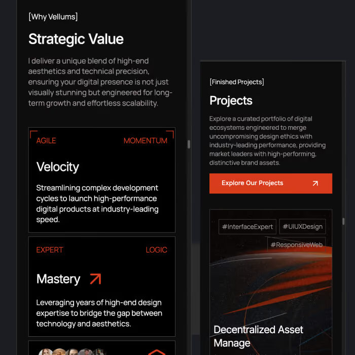
All breakpoints are carefully tested to ensure a smooth and consistent experience.
Performance Optimization Approach
All templates are built manually without automated export from design tools like Figma. This results in a clean structure, fast loading, and better overall optimization. The goal is to create a lightweight, efficient, and easy-to-use template that performs well across all devices.
Clean DOM Structure
Each template uses a clean and simplified DOM structure without unnecessary elements or complexity. Only essential classes and elements are used. This makes the project easier to navigate, faster to load, and simple to edit or update.
Minimal Interactions
Animations are built using GSAP and follow Webflow Marketplace best practices. They are lightweight and used only where they add value to the user experience. The focus is on smooth and subtle interactions that enhance the content without slowing down the website or making editing more complex.
Optimized Assets and Loading
All images are compressed and optimized using modern formats such as AVIF. Lazy loading is applied to ensure faster page loading. This approach improves performance, reduces load time, and ensures a smooth experience across all devices and screen sizes.
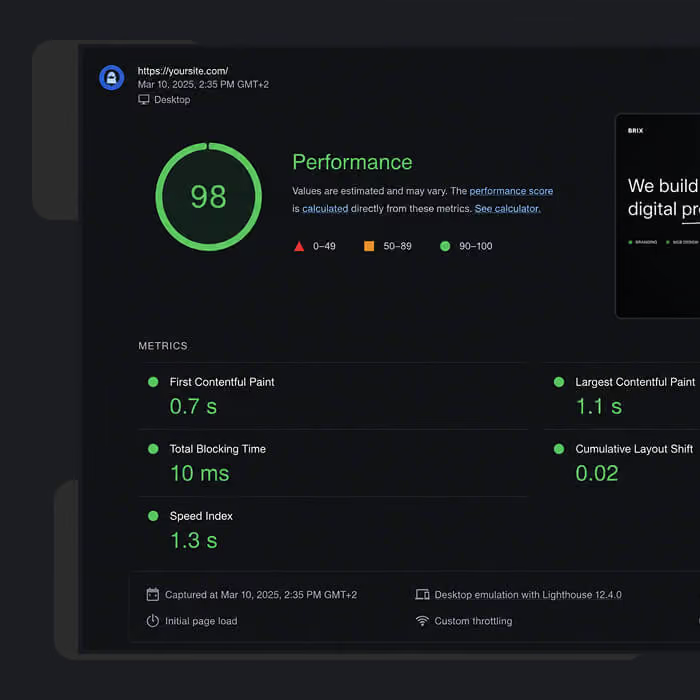
The structure is optimized to achieve high performance scores and smooth interactions.
SEO and Semantic Structure
All templates are built following basic SEO best practices that can be implemented directly in Webflow.
This helps search engines better understand your website and improves indexing and long-term performance. The goal is to give you a solid SEO foundation without needing extra setup.
This helps search engines better understand your website and improves indexing and long-term performance. The goal is to give you a solid SEO foundation without needing extra setup.
Heading Hierarchy
Each page has a clear and consistent heading structure from H1 to H6. There is only one H1 per page, which defines the main topic. All other content is organized using H2 and H3 headings in a logical order. This helps search engines understand the content structure and improves readability for users.
Clean HTML Structure
All pages use semantic HTML elements such as section, header, main, footer, and nav. This improves SEO, accessibility, and overall site structure. The layout is clean and does not include unnecessary wrappers or complex nesting. Everything is already properly structured, so you don’t need to add or fix anything.
Result: A clean, lightweight, and SEO-friendly structure that is easy to edit and scale.
Result: A clean, lightweight, and SEO-friendly structure that is easy to edit and scale.
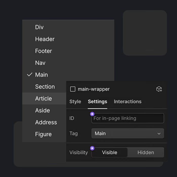
Built for SEO Best Practices
Benefits of the Framework
The Client-First framework makes your website faster, cleaner, and easier to manage, edit, and scale. The clear class system helps you quickly understand how everything works. The variables system allows you to easily update spacing, typography, and colors in one place. This creates a flexible and future-ready foundation for any project.
Faster Customization
You can quickly update page content, add or edit sections, and create new components without сложности. CMS collections are easy to fill and expand as your project grows. All classes follow one consistent system, so you always know where and how to make changes. This helps you work faster and understand the structure without confusion.
Easy Scaling
The templates are built to support growth from the start. You can easily add new pages, sections, and content without breaking the layout. By reusing components, you can scale your website quickly while keeping everything consistent and organized.
Better Maintainability
The clean structure and clear class naming make the project easy to maintain and update. All sections are built manually without auto-generated code, which keeps the structure lightweight and predictable. You can update styles using variables without affecting core classes or breaking layouts. This ensures long-term stability and makes the template reliable for future updates.
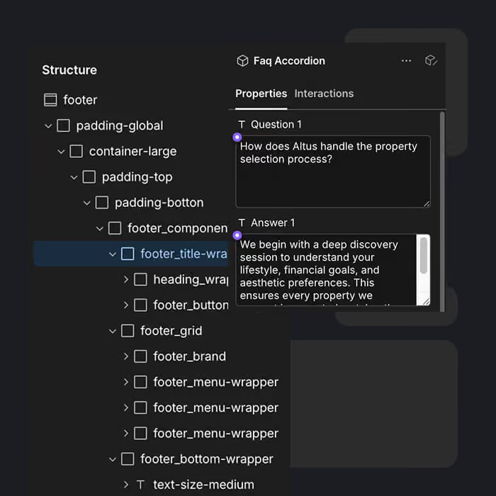
Built for Webflow Marketplace
Is Webflow a Good Fit for Agencies?
Webflow can be a good fit for agencies that want repeatable website delivery across multiple client projects. A consistent development framework helps teams reuse components, standardize CMS structures, and maintain predictable class naming across websites. Instead of rebuilding common elements from scratch, developers can follow an established process to build, customize, and maintain client websites more efficiently.
How Webflow Supports Repeatable Website Delivery
Reusable Components: Build common sections once and reuse them across pages and projects where appropriate.
Consistent Development Standards: Use a shared class system, design variables, and clear naming conventions to make projects easier to understand and maintain.
Structured CMS Architecture: Follow predictable collection and field structures to simplify content management and future updates.
Scalable Workflows: Establish repeatable processes for responsive layouts, customization, testing, and website handoff.
Webflow alone does not guarantee repeatable delivery. The real benefit comes from combining its visual development tools with a consistent framework, documented standards, and a reliable project workflow.
Consistent Development Standards: Use a shared class system, design variables, and clear naming conventions to make projects easier to understand and maintain.
Structured CMS Architecture: Follow predictable collection and field structures to simplify content management and future updates.
Scalable Workflows: Establish repeatable processes for responsive layouts, customization, testing, and website handoff.
Webflow alone does not guarantee repeatable delivery. The real benefit comes from combining its visual development tools with a consistent framework, documented standards, and a reliable project workflow.