
Technical & Customization
Development Methodology & Webflow Structure
What methodology do you use to build your templates?
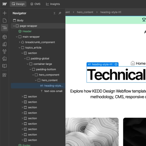
All our templates are built using the Finsweet Client-First 2.1 methodology. Unlike many other authors, we do not rely on automated tools or direct Figma to Webflow imports. Every section is manually coded and styled from scratch with absolute precision.
This approach ensures a logical, clean structure, making it effortless for you to scale your site, add new sections, and maintain consistency using standard, readable class names.
How are your Webflow templates structured?
All KEDD Design templates have a clean structure and are built for easy customization, scalability, and maintenance. Every template uses the Finsweet Client-First 2.1 methodology and includes a consistent design system with a color palette, typography system, and spacing system.
The template structure includes:
- Clear and readable section names on every page
- A correct heading hierarchy from H1 to H6
- Reusable Webflow Components for repeated sections such as Header, Footer, buttons, and other content blocks
- Webflow CMS Collections for dynamic pages with the required fields
- Variables for quick changes to colors, spacing, and typography styles
- Responsive layouts for desktop, tablet, and mobile devices
- Basic SEO optimization for search engines, including structured headings, Title and Meta Description settings for static pages, separate SEO fields for dynamic pages, optimized images, and ALT text
- Structured FAQ sections with H2/H3 headings and answers that include lists, quotes, and highlighted text, JSON-LD markup for FAQ and breadcrumbs, and a fully detailed llms.txt file to help AI systems better understand the website content.
Do you use Client-First by Finsweet in your templates?
We use the Finsweet Client-First 2.1 methodology in every Webflow template.
This approach allows us to create clear and readable CSS class names throughout the project. This makes it easier for developers to understand the page structure, expand sections with new content, create new pages using the existing structure, and scale the website over time.
How do you organize classes and naming conventions?
Classes and their names are created based on the content and purpose of each section. This allows developers to understand which section they are working with, what content it contains, and how the elements are structured on the page.
This approach makes it easier to scale each page and create new sections for new content.
Class names are created according to the elements they control. With Client-First 2.1, you can also reuse classes that have already been created in the website. This helps avoid creating new duplicate classes for every page.
For example, a Services section can use the following class structure:
- section-services — the base class for the section, where you can set top and bottom padding.
- services_container — a standard global container used to control the content width.
- services_component — the main wrapper inside the section where all content is placed.
- services_header — the block for the section heading, including the title and short description.
- services_heading — the class for the section heading, such as an H2 or H3.
- services_text — the class used for the text description below the heading.
- services_list — the main grid or flex container that holds all service cards.
- services_item — an individual card inside
services_listused to display repeated content consistently. - services_image-wrapper — the image wrapper where you can add custom styles, animations, or hover effects.
- services_image — the image element.
- services_content — the text block inside the card containing all required content.
- button-wrapper — a reusable global wrapper for buttons inside cards, sections, or pages. It can also be created as a Component for easier scaling and maintenance.
Are your Webflow templates built for future scalability?
Yes. All KEDD Design templates have a clean class structure and reusable Components for repeated content and sections.
You can easily expand existing sections, create new pages, add new CMS Collections, and extend existing collections.
As your services and business grow, your website can grow with them while keeping the same structure and clean Webflow development system.
In the future, you can customize and scale the website by:
- Creating new classes to expand existing sections
- Reusing existing blocks on other pages
- Scaling and modifying Webflow Components
- Using existing Components on new pages
- Creating new CMS fields
- Expanding existing dynamic CMS pages
- Creating new CMS Collections based on data from other collections
- Reusing existing classes with responsive styles for desktop, tablet, and mobile devices
- Working with existing SEO functionality to improve website visibility in search engines
Do your templates use reusable Webflow Components?
Every KEDD Design template includes reusable Webflow Components that are used across multiple pages.
This makes it easy to update important information in one place and apply the changes across the entire website.
Components are especially useful for:
- Header — you can change page links, the logo, contact information, CTA button text, and the button link in one place.
- Buttons — reusable button Components make it easy to change button text and links. This can help you quickly test different CTA text for better website conversion and update links across multiple pages.
- Footer — the Footer Component makes it easy to update phone numbers, office address, location map, social links, and other information displayed at the bottom of the website.
Responsive Design & Browser Compatibility
Are your templates responsive and mobile-friendly?
Yes, our Webflow templates are fully responsive and mobile-friendly. Each template is carefully tested across different screen sizes, from large 1920px desktop monitors to smaller mobile devices.
You can be confident that your website will look and work correctly across different devices and screen sizes.
On mobile devices, some sections use different layouts to make the content easier to read and more compact. Depending on the template, this may include:
- Horizontal scrolling
- Cards overlapping each other
- Content revealed while scrolling
- Compact layouts for long sections
These responsive techniques help reduce unnecessary page length while keeping the content easy to navigate on smaller screens.
According to StatCounter, the worldwide device market share from August 2025 to August 2026 was approximately:
- Mobile: 49.36%
- Desktop: 49.11%
- Tablet: 1.54%
This shows why responsive Webflow design is important for both mobile devices and large desktop screens.
A good Webflow template should not only look good on desktop. It should provide a comfortable experience across all major screen sizes.
Are your templates compatible with all modern browsers?
Yes. Our Webflow templates are designed to be cross-browser compatible and tested across the major modern browsers, including:
- Google Chrome
- Safari
- Firefox
- Microsoft Edge
- Opera
We aim to ensure that the website layout, content, interactions, and other design elements work consistently across supported browsers.
According to StatCounter, worldwide browser usage from August 2025 to August 2026 was approximately:
- Chrome: 69.39%
- Safari: 15.83%
- Edge: 5.36%
- Firefox: 2.98%
- Opera: 1.94%
These statistics show why testing across the most widely used browsers is an important part of Webflow website development.
Our goal is to provide a consistent user experience regardless of which modern browser visitors use.
How are Webflow breakpoints configured in your templates?
Each KEDD Design Webflow template uses 7 responsive breakpoints. We configure these breakpoints to make sure the layout works correctly across different screen sizes.
Our standard breakpoint structure includes:
- 1920px and up — Styles added here apply to screens 1920px and larger.
- 1440px and up — Styles apply from 1440px and up unless they are changed at a larger breakpoint.
- 1280px and up — Styles apply from 1280px and up unless they are changed at a larger breakpoint.
- Desktop Base — The main desktop styles. These styles apply across breakpoints unless they are overridden at a larger or smaller breakpoint.
- 991px and down — Tablet — Styles for tablets and smaller screens.
- 767px and down — Mobile Landscape — Styles for smaller tablets and mobile landscape layouts.
- 479px and down — Mobile — Styles for mobile portrait screens.
We adjust the layout at each breakpoint to make the content readable, accessible, and comfortable to use.
This responsive structure makes it easier to maintain and customize a Webflow template across different devices.
Are the templates tested on mobile, tablet, and desktop devices?
Yes. Every KEDD Design Webflow template goes through responsive testing across desktop, tablet, and mobile devices.
We review each page and fix potential layout or responsive issues before releasing the template.
Our testing process includes both browser-based responsive testing and testing on physical devices, including:
- Large desktop monitors
- Laptops
- Tablets
- Mobile phones
We pay particular attention to these responsive sizes:
- Desktop: 1280px / 1440px / 1920px and above
- Tablet: 991px / 1024px
- Mobile Landscape: 767px / 768px
- Mobile Portrait: 479px / 480px and below
According to StatCounter Screen Resolution Statistics, some of the most commonly used screen resolutions worldwide from August 2025 to August 2026 include:
- 1920×1080px — 10.77%
- 414×896px — 6.84%
- 360×800px — 5.63%
- 384×832px — 4.21%
- 1366×1366px — 4.15%
- 390×844px — 3.41%
Responsive testing is especially important because visitors can access the same Webflow website from very different screen sizes.
Can I customize the responsive layout and breakpoints?
Yes. You can fully customize the responsive layout and Webflow breakpoints in the Webflow Designer.
You can use the Breakpoint Bar in Webflow to select a specific breakpoint and check how your page looks at that screen size.
If you continue working with the existing classes using the Client-First 2.1 methodology, the classes will inherit their existing responsive styles unless you create breakpoint-specific overrides.
When expanding or scaling a template and creating new classes, we recommend checking all breakpoints and adjusting the responsive layout when necessary.
We recommend reviewing your responsive settings after adding:
- A new section
- A new page
- New components
- New CMS content
- Significant content changes
This helps prevent responsive issues when a Webflow website becomes larger and more complex.
When scaling a Webflow template, always check how new content behaves across all breakpoints.
Global Styles, Variables & Design System
How are the global styles set up in your templates?
Each KEDD Design template comes with Global Styles already configured for Webflow and Rich Text elements. This saves you time because you do not need to set up these styles from scratch.
Global Styles can be used across both static pages and dynamic CMS pages, including Rich Text content.
Each template includes 17 Global Styles, following the recommendations in the Webflow Template Submission Guidelines:
- Body
- Heading 1
- Heading 2
- Heading 3
- Heading 4
- Heading 5
- Heading 6
- Paragraph
- Block Quote
- Numbered List
- Bulleted List
- List Item
- Text Link
- Bold Text
- Emphasis
- Superscript
- Subscript
You can easily customize these Global Styles to match your brand guidelines and apply the changes consistently across your entire website.
Global Styles help keep your typography and Rich Text content consistent across your Webflow project.
Why this is useful
Using predefined Webflow Global Styles means you can:
- Keep typography consistent across all pages
- Use the same styles in static and CMS content
- Quickly update headings, paragraphs, lists, and links
- Avoid creating the same styles manually for every page
- Maintain a cleaner and more scalable Webflow design system
Can I easily change the color palette and typography across the whole site?
Yes. Every KEDD Design template uses Webflow Variables to make it easy to change the color palette and typography across the entire website.
All main colors are added as Variables and can be easily customized. You can also add your own colors when needed.
Color Variables
Each color has a clear and consistent name, for example:
- Neutral 100
- Neutral 200
- Neutral 300
- Neutral 400
Typography Variables
Typography settings are also organized into Variables, including:
- Color
- Font Size
- Font Family
- Font Weight
- Line Height
- Letter Spacing
Using Variables allows you to change colors and typography from one place and apply the changes throughout the Webflow template.
Instead of changing styles page by page, you can update your design system from one central location.
This makes the template easier to customize, maintain, and scale as your website grows.
How are Webflow Variables used in your templates?
KEDD Design templates use Webflow Variables as part of the design system to make customization, maintenance, and future scaling easier.
We create Variables for the main design properties that are commonly changed when building or customizing a website.
The Variables are organized into five main groups:
- Colors
- Spacing — Padding & Margin
- Gaps
- Border Radius
- Typography
This structure allows you to make global design changes without manually editing individual elements across multiple pages.
Based on our survey of 19 KEDD Design clients, 100% use Webflow Variables when working with our templates. The Variables used most often are related to:
- Typography
- Colors
- Spacing
Webflow Variables make it easier to maintain a consistent design system while quickly adapting a template to a new brand.
Can I change spacing, margins, padding, and gaps globally?
Yes. You can change spacing, margins, padding, and gaps globally using the Webflow Variables included in KEDD Design templates.
Variables can be configured for different responsive breakpoints, or you can make a change specifically for the breakpoint where you need it.
The design system includes separate settings for:
- 1920px
- 1440px
- Base
- Tablet
- Mobile Landscape
- Mobile
For example, you can set:
- Base:
8rempadding - Mobile:
2rempadding
This makes it much easier to adapt layouts for smaller screens without changing every element individually.
Why this is useful for responsive design
Responsive spacing Variables help you:
- Adjust layouts for mobile devices
- Reduce spacing on smaller screens
- Keep spacing consistent across pages
- Make global responsive changes faster
- Maintain a scalable Webflow design system
Responsive Variables make it easier to control how much space your content needs on different screen sizes.
Can I add my own Variables to the design system?
Yes. You can add and customize your own Webflow Variables based on the existing KEDD Design system.
You can create new Variables and configure them for the responsive breakpoints used in the template.
To create a new Variable:
- Open the required Variable collection.
- Click New Variable.
- Choose the Variable type, such as:
- Color
- Size
- Percentage
- Number
- Font Family
- Enter a clear Variable Name.
- Set the required color, size, or other value.
You can also create a new group of Variables by using a slash / in the Variable name.
For example:
Heading H2/Color
This creates a structure where Heading H2 becomes the group and Color becomes the Variable inside that group.
You are not limited to the Variables included in the template. You can extend the design system as your website grows.
This makes the KEDD Design system flexible enough for custom branding, new components, additional pages, and future website scaling.
CMS Collections & Dynamic Content
How do I manage the CMS Collections included in the template?
You can manage all CMS Collections directly from the CMS panel in Webflow Designer.
To open your CMS Collections:
- Open the Webflow Designer.
- Click the CMS tab in the left panel.
- You will see all CMS Collections included in the template.
Each Collection works like a database for a specific type of content, such as blog posts, projects, team members, or other dynamic content. Individual entries inside a Collection are called Collection items.
How to add a new CMS item
To create a new item:
- Open the required CMS Collection.
- Click New [Collection Item].
- Fill in the required fields, such as:
- Plain Text
- Rich Text
- Images
- Links
- References
- Click Create draft.
- When the content is ready, choose Publish now or another publishing option.
Draft items are not live on your website. When you publish an item, it becomes available on the live site according to your Collection page and publishing settings.
Dynamic Collection pages
The CMS fields in KEDD Design templates are already connected to the dynamic Collection page template.
This means you can add or edit content in the CMS without rebuilding the page layout manually.
For example, if you have a blog Collection, you can create a new blog post, add its title, image, and Rich Text content, and Webflow will use the existing Collection page design to display that content.
Create the content once in the CMS and let the Collection page template handle the layout.
All Collection items in the same Collection use the same Collection page template. When you change the design of that template, the change is applied to all Collection pages using it.
How to change or add Collection fields
If you need to change the structure of a Collection, open the Collection Settings and manage the fields used by that Collection.
You can add new fields and, where appropriate, update or remove existing fields. Before removing a field, check where it is used on your Collection pages or other dynamic content so you do not break existing connections. Webflow allows Collection fields to be used as dynamic data throughout your design.
Webflow provides different field types for different kinds of content, including:
- Plain Text
- Rich Text
- Image
- Multi-image
- Video
- Link
- Phone
- Number
- Date/Time
- Switch
- Color
- Option
- File
- Reference
- Multi-reference
The exact field options available can depend on the current Webflow CMS features and plan.
After creating a new field:
- Save the Collection settings.
- Open an existing Collection item or create a new one.
- Add content to the new field.
- Connect the field to the appropriate element on your Collection page.
This gives you a flexible Webflow CMS structure that can grow as your website needs more content.
Can I add new fields to existing CMS Collections?
Yes. You can add new CMS Collection fields to an existing Collection at any time.
To add a new field:
- Open the Collection settings.
- Click Add Field.
- Select the required field type.
- Give the field a clear name.
- Save the Collection.
- Add content to the new field in your Collection items.
To display the new content on your Collection page:
- Add the required element to the page.
- Open the Element Settings.
- Click the purple dynamic data icon.
- Select the new Collection field.
The element will then display the content stored in that CMS field. Webflow uses the purple dynamic data controls to connect elements to Collection fields.
Pay attention to Text and Rich Text fields
One important detail is the difference between Plain Text and Rich Text fields.
A Plain Text field contains unformatted text and can be connected to text elements, but not to a Rich Text element.
A Rich Text field is designed for formatted content and can contain headings, paragraphs, links, images, and other supported Rich Text content.
Choose the field type based on how you want the content to be displayed. Plain Text and Rich Text are not interchangeable.
Can I create new CMS Collections?
Yes. You can create new CMS Collections when you need to store a new type of content.
To create a new Collection:
- Open the CMS tab in the Webflow Designer.
- Click Create a Collection or the Create New Collection icon.
- You can optionally choose a Collection template with preconfigured fields.
- Enter the Collection name.
- Set the Collection URL.
- Add the fields required for your content.
- Click Create Collection.
Webflow automatically creates a Collection page template for the new Collection. Each Collection item can then use this template to generate its own dynamic page.
A CMS Collection is essentially a structured database for one type of content, while the Collection page controls how that content is displayed.
For example, you could create Collections for:
- Blog Posts
- Projects
- Team Members
- Services
- Testimonials
- Case Studies
This makes it possible to expand the website without creating every page manually.
Can I customize CMS Collection Templates and dynamic pages?
Yes. You can fully customize the design of Collection pages in the Webflow Designer, just like you customize other pages.
You can:
- Add new sections
- Create new content blocks
- Change grids and layouts
- Add paragraphs
- Add Rich Text elements
- Add images and other elements
- Change fonts and colors
- Connect new elements to CMS fields
- Add static and dynamic content
Collection pages use one shared template for all items in the Collection. This means that when you change the Collection page design, the change is applied to all Collection pages using that template.
The content, however, can be different for every Collection item.
For example:
Same design → different content → different URL
Each Collection item can have its own:
- Title
- Images
- Text
- CMS fields
- References
- URL/slug
The Collection page controls the design. The CMS Collection item controls the content.
This separation makes it much easier to build and manage a scalable Webflow website.
Can I add new dynamic content to the template?
Yes. You can add new CMS Collection items to the Collections included in the KEDD Design template.
Each Collection can contain up to 60 custom fields. You can reuse the same fields for multiple Collection items, but each item should have its own unique content and name.
For example, if you have a Projects Collection, you can continue adding new projects using the same CMS structure. Each project can have its own title, images, description, category, and other content while using the same Collection page design.
If 60 custom fields are not enough for the content structure you need, you can create an additional CMS Collection with the required fields and connect it to the main Collection using a Reference or Multi-reference field.
For example:
Projects Collection → Multi-reference → Services Collection
This allows you to create a more structured CMS and connect related content between different Collections.
A well-structured Webflow CMS allows you to scale your website content without rebuilding the page layout for every new item.
This approach is useful for websites with a large amount of dynamic content, such as projects, case studies, blog posts, services, team members, or other CMS-driven pages.
Can I connect new pages and sections to existing CMS Collections?
Yes. You can connect new sections and pages to existing Webflow CMS Collections using Collection Lists and dynamic data.
A Collection List allows you to display dynamic content from a CMS Collection on a static page or another Collection page.
To add one:
- Open the Add panel.
- Go to Elements → CMS.
- Add a Collection List to the page.
- Open Collection List Settings.
- Under Source, select the CMS Collection you want to display.
A Collection List has the following structure:
- Collection List Wrapper
- Collection List
- Collection Item
You can then add elements inside the Collection Item, such as:
- Heading
- Paragraph
- Rich Text
- Image
- Button
- Link
You can connect these elements to the appropriate CMS fields using the purple dynamic data icon in the Element Settings.
For example, you could connect:
Heading → Project Name
Paragraph → Project Description
Image → Project Image
Button → Project Collection Page
When the Collection List is dynamic, new published Collection items can automatically appear in the list according to its filters, sorting, pagination, and display settings.
Collection Lists let you reuse CMS content in different sections of your website without manually creating each item.
Custom Code, Integrations & Functionality
Do you use custom code in your templates, or are they 100% native Webflow?
KEDD Design templates are built primarily with native Webflow features. We follow the Webflow Template Submission Guidelines, which restrict custom code and third-party integrations in Marketplace templates.
This means you can work with the template using Webflow's native features without depending on external scripts or third-party code.
Webflow currently allows only a limited number of exceptions for Marketplace templates, including:
- GSAP Custom Code
- Font smoothing code in Project Settings
- Required
noindexcode on specific template pages - SVG code when properly documented
For this reason, KEDD Design templates do not include unnecessary third-party scripts or custom code that could make the project harder to maintain.
At the same time, the template structure remains open and customizable. After installing the template, you can add your own HTML, CSS, JavaScript, external libraries, APIs, and other integrations when your project requires additional functionality.
The template starts with a clean and stable Webflow foundation, while still giving you the freedom to add custom functionality when needed.
Webflow also notes that custom code is an advanced modification and may affect compatibility or functionality, so it should always be tested before publishing.
Can I add custom code to a KEDD Design Webflow template?
Yes. After installing a KEDD Design template, you can add your own HTML, CSS, and JavaScript using several Webflow options.
1. Page-level Custom Code
You can add custom code to an individual page through Page Settings → Custom Code.
You can add code:
- Inside the
<head>tag - Before the
</body>tag
This code applies only to the selected page.
This option is useful when you need custom functionality, CSS, metadata, or scripts on one specific page. Webflow recommends placing most JavaScript before the closing </body> tag when possible because it can improve page loading performance.
2. Site-wide Custom Code
You can also add custom code globally through:
Site Settings → Custom Code
There are two main sections:
- Head Code — code is added before the closing
</head>tag and applies to the entire website. - Footer Code — code is added before the closing
</body>tag and applies to the entire website.
This is useful for scripts, styles, external resources, analytics, and other code that needs to work across multiple pages.
3. Code Embed
You can add a Code Embed element directly to the Webflow Designer.
This allows you to place custom HTML, CSS, JavaScript, or third-party embed code directly inside your page layout.
A Code Embed is useful for:
- Custom HTML blocks
- Third-party embeds
- Forms and surveys
- Widgets
- Custom JavaScript
- Custom CSS
- External services
Code Embed can also use dynamic CMS data, allowing embedded code to change based on Collection fields.
Use page settings for page-specific code, site settings for global code, and Code Embed when you need to place custom code directly inside the page layout.
Check your custom code before publishing
Custom code can affect website functionality and performance. If you add JavaScript or external libraries, always test the website after adding the code.
You can use the Chrome Developer Tools → Console to check for JavaScript errors.
You should also test the page with Google PageSpeed Insights after adding external scripts or heavy libraries. Large or unnecessary scripts can increase page load time and affect website performance.
Can I add JavaScript or external libraries to the template?
Yes. After installing a KEDD Design template, you can add JavaScript and external libraries to your Webflow project.
You can add them:
- Globally through Site Settings → Custom Code
- Locally through Page Settings → Custom Code
- Directly inside the page using a Code Embed element
For example, you can connect external JavaScript libraries, APIs, widgets, analytics tools, or other third-party services when your project requires them.
When adding an external <script> to the <head>, consider using async or defer when appropriate. Webflow notes that external scripts in the <head> can slow down page loading.
After adding custom JavaScript or an external library, publish and test the website to make sure the code works correctly.
You should check:
- Browser Console for JavaScript errors
- Website functionality
- Mobile and tablet layouts
- Page loading performance
- Google PageSpeed Insights
Custom code gives you more flexibility, but every external script should have a clear purpose and should be tested before going live.
Do you provide assistance with third-party integrations such as Zapier or Memberstack?
KEDD Design templates are built with a clean and modular Webflow structure, making them suitable for connecting third-party services after installation.
You can connect services such as:
- Zapier
- Make
- Memberstack
- CRM platforms
- Email marketing services
- Automation tools
- External APIs
You can connect these services using their supported Webflow integrations, custom code, webhooks, APIs, or automation platforms, depending on the service.
However, KEDD Design templates do not include third-party integrations or API tokens in the Marketplace template itself. Webflow's Marketplace guidelines require template integrations to remain at their default settings and prohibit adding third-party integrations to the submitted template.
The template is integration-ready, but you connect your own third-party services after installing it.
We can provide general guidance on the template structure and where custom code or integration elements can be added. However, the setup and configuration of third-party services may depend on their own documentation, API, pricing, and technical requirements.
Can I connect forms and third-party services to the template?
Yes. You can use native Webflow Forms and connect them to third-party services after installing the template.
Webflow's Form Block allows you to create contact forms and configure individual form fields directly in the Webflow Designer.
Depending on the field configuration, you can use input types such as:
- Text
- Password
- Phone
- Number
- URL
You can also configure important settings for each field, including:
- Field Name
- Required
- Placeholder
- Input type
The Name identifies the field in form submissions, while Required controls whether visitors must complete the field before submitting the form. Webflow also recommends using proper field labels instead of relying only on placeholders, especially for accessibility.
You can also customize the form's:
- Success message
- Error message
- Input focus states
- Field labels
- Form layout
- Styling
Connecting forms to external services
KEDD Design templates can also be connected to third-party services through webhooks, automation platforms, APIs, or other supported integration methods.
For example, form submissions can be sent to:
- CRM systems
- Google Sheets
- Email marketing platforms
- Automation tools
- Lead management systems
This allows you to use the native Webflow form as the front-end while sending submitted lead data to the external service you use.
You can keep the form design inside Webflow while connecting submitted data to the tools your business already uses.
For third-party integrations, always follow the documentation and requirements of the specific service you are connecting.
Template Customization & Technical Changes
How can I request a custom feature or template modification?
You can contact KEDD Design if you need help adding new functionality or customizing a Webflow template.
We will review your requirements, analyze the existing template structure, and provide recommendations on the best way to customize and scale the template for your content.
We can help you with:
- Creating and configuring Webflow Variables
- Setting up basic SEO optimization
- Creating new CMS Collections
- Expanding existing CMS Collections for specific functionality
- Improving responsive design
- Customizing Components and their properties
- Adding or adjusting custom functionality
- Preparing the website for better visibility and AI search and AI agents
We also pay special attention to AI optimization and can help structure your website so that important information is easier for AI systems such as ChatGPT, Gemini, and Claude to understand and reference.
According to the Webflow AEO Maturity Index, among 2,000 websites, only 16% of websites meet queries across all types of business in search engines.
A well-structured website is not only easier for people to use. It also gives search engines and AI systems clearer information to understand and reference.
Can I completely customize the design of the template?
Yes. If you have basic knowledge of Webflow and understand how HTML and CSS work, you can customize the template yourself.
You can change the layout, colors, typography, spacing, Components, CMS content, animations, and other parts of the design.
However, learning all the key Webflow skills takes time. For a person starting with a basic level of knowledge, we recommend allowing around 1–3 months to become comfortable with the main Webflow features and workflows.
The exact time depends on your previous experience with Webflow, HTML, CSS, design systems, CMS, and responsive design.
KEDD Design templates are built to be customized, not locked to the original design.
Can I create new pages and sections?
Yes. You can create new Webflow pages and sections in every KEDD Design template.
Creating a new page
To create a new page:
- Open the Pages panel in Webflow Designer.
- Click the + icon.
- Select New page.
- Add the required page information.
- Set the Title and Meta Description.
- Add an Open Graph Image in JPG format.
- Click Create.
We recommend setting the basic SEO information for every new page before publishing it.
Creating a new section
To create a new section:
- Add a Section element to the page.
- Give the section a clear class name.
- Add the required layout and content.
- Connect any dynamic content if the section uses a CMS Collection.
You can use the existing KEDD Design Client-First structure, Variables, Components, and design system when creating new pages and sections.
You can expand the template with new pages and sections without rebuilding the existing design system.
Can I modify existing Webflow Components?
Yes. You can modify existing Webflow Components and create new Components for additional content.
When you edit the Main component, changes to its structure and design can affect all instances of that component across the website. Webflow also allows individual instances to have unique values through Component properties (Props).
You can modify a Component by:
- Changing its structure
- Adding new elements
- Removing elements
- Updating styles
- Updating shared content
- Creating new properties
- Using different property values for individual instances
Component Properties
You can also use Component Properties (Props) to make specific parts of a Component editable without opening the Main component every time.
For example, you can create properties for:
- Text
- Images
- Links
- Visibility
- Other supported Component settings
This allows you to keep the same Component structure while using different content for individual instances.
Webflow also provides Suggested Props, which can help identify supported elements that can be converted into Component properties. You can review these suggestions and choose which properties to create.
Components keep the structure consistent, while Props allow individual instances to have their own content and settings.
This makes Components especially useful for scalable Webflow websites where the same design pattern is used across multiple pages.
Can I change or remove animations and interactions?
Yes. You can modify, disable, or remove animations and interactions included in the template.
However, be careful when making changes. One interaction can control multiple elements or affect the behavior of a component across different pages.
For newer Webflow Marketplace templates, GSAP-powered Webflow Interactions are the default. Webflow states that Webflow Interactions powered by GSAP became the default for Marketplace templates starting May 1, 2026, and recommends avoiding legacy interactions.
Classic Interactions may still appear in older projects or templates, but new Marketplace templates should use the current GSAP-based system.
To review an animation:
- Open the page in Webflow Designer.
- Select the required element.
- Open the Interactions panel.
- Select the relevant interaction or animation.
- Review, edit, disable, or remove the animation.
For GSAP animations, Webflow also recommends documenting how the animations work and how they can be edited or removed.
Before removing an interaction, check which elements and pages depend on it.
This is especially important when working with complex animations, reusable Components, or interactions that control multiple elements.
Can I replace the existing design system with my own?
Yes. You can replace or customize the existing Webflow design system and adapt it to your own brand.
The main design properties in KEDD Design templates — including:
- Spacing
- Padding and margin
- Gaps
- Border radius
- Typography
- Colors
are built using native Webflow Variables and standard Tag Selectors following the Client-First 2.1 methodology.
This gives you a structured starting point that you can adapt to your own brand guidelines.
You can change the existing Variables, add new Variables, adjust Tag Selectors, create new Components, and extend the system as your website grows.
The existing design system is a starting point. You can adapt it to your own brand instead of rebuilding everything from scratch.
Can you customize a Webflow template for my brand?
Yes. KEDD Design provides Webflow template customization services for brands that need a more personalized website.
You can learn more about our customization service on the Webflow Template Customization page.
We can help you:
Customize your design system
We can transfer and integrate your existing design system into the Webflow template, including:
- Colors
- Spacing
- Padding and margins
- Typography
- Font size
- Font color
- Letter spacing
- Line height
Customize Components and content
We can customize existing Components, create new Components, and place them on the appropriate pages.
Expand the CMS
We can customize existing CMS Collections, add new fields, expand their functionality, and create new CMS Collections when needed.
You can see an example of a larger CMS customization in our case study about the Kyrgyzstan Hockey Federation.
Optimize the website for SEO and AI
We can also help with technical SEO and AI optimization.
Depending on your business and content structure, we can create additional pages and sections that make important information easier for ChatGPT, Gemini, Claude, and other AI systems to understand and reference.
For example, we documented this approach when building the Altuss luxury real estate Webflow template.
Audit the website
We can also review the customized website and identify technical issues.
For example, while customizing a Webflow template for a Personal Branding Agency, we identified problems with the heading hierarchy and corrected them as part of the customization process.
Template customization is not only about changing colors and fonts. It can also include CMS architecture, responsive design, SEO, Components, technical improvements, and AI-focused content structure.
Can you make technical changes to a template after purchase?
Yes. After purchasing a KEDD Design template, you can make technical changes and extend its functionality according to your project requirements.
You can:
- Create new pages
- Create new sections
- Create and edit Components
- Create Component Properties (Props)
- Expand CMS Collections
- Add new CMS Collections
- Add custom code
- Add JavaScript and external libraries
- Edit existing animations
- Add new animations
- Change Webflow Variables
- Customize the design system
- Add third-party integrations
You can make these changes yourself or contact KEDD Design if you need help with customization or technical development.
A Webflow template is the starting point for your website. You can continue developing and scaling it after purchase as your project grows.
Documentation, Guides & Technical Support
Do you provide any documentation or video guides on how to use your templates?
Every KEDD Design Webflow template includes a dedicated Style Guide page within the project.
The Style Guide works as a central reference for the template and explains how the project is structured. It includes information about:
- Classes and class structure
- Webflow Variables
- Typography settings
- Colors and spacing
- Layout and design components
- Global styles and other design system settings
This gives you the technical information you need to understand the Webflow template structure, make changes, and customize the project with confidence.
The Style Guide is your central reference for understanding and customizing the template.
We also provide free technical consultations if you need help understanding how a specific part of the template works.
Do you provide technical support after purchase?
Yes. We provide free technical support and consultations for all Webflow templates created by KEDD Design.
If you have questions about how the template works, you can contact us by email at tor through any available messenger.
We can help with questions related to:
- Template structure and class system
- Webflow CMS
- Variables and global styles
- Components and responsive layouts
- Template settings and features
- Basic technical questions about using the template
If you need more than technical support, we can also provide professional Webflow customization services for an additional fee.
Technical support helps you understand and use the template. Customization services are available when you need us to make changes for you.
Can I request help with customizing the template?
Yes. We provide professional Webflow customization services for both KEDD Design templates and other Webflow projects.
You do not have to use a KEDD Design template to work with us. Even if you purchased a Webflow template from another author on the Webflow Marketplace, you can contact us for customization.
Depending on your needs, we can help with:
- Design customization and rebranding
- Colors, typography, spacing, and Variables
- New pages and sections
- Webflow CMS setup and expansion
- Responsive layout adjustments
- Components and interactions
- SEO and AI optimization
- Technical improvements and other Webflow changes
First, we review your project and requirements. Then we recommend the best approach, provide an estimated cost, and handle the required changes.
You can use our Webflow customization service with any Webflow project, regardless of who created the original template.